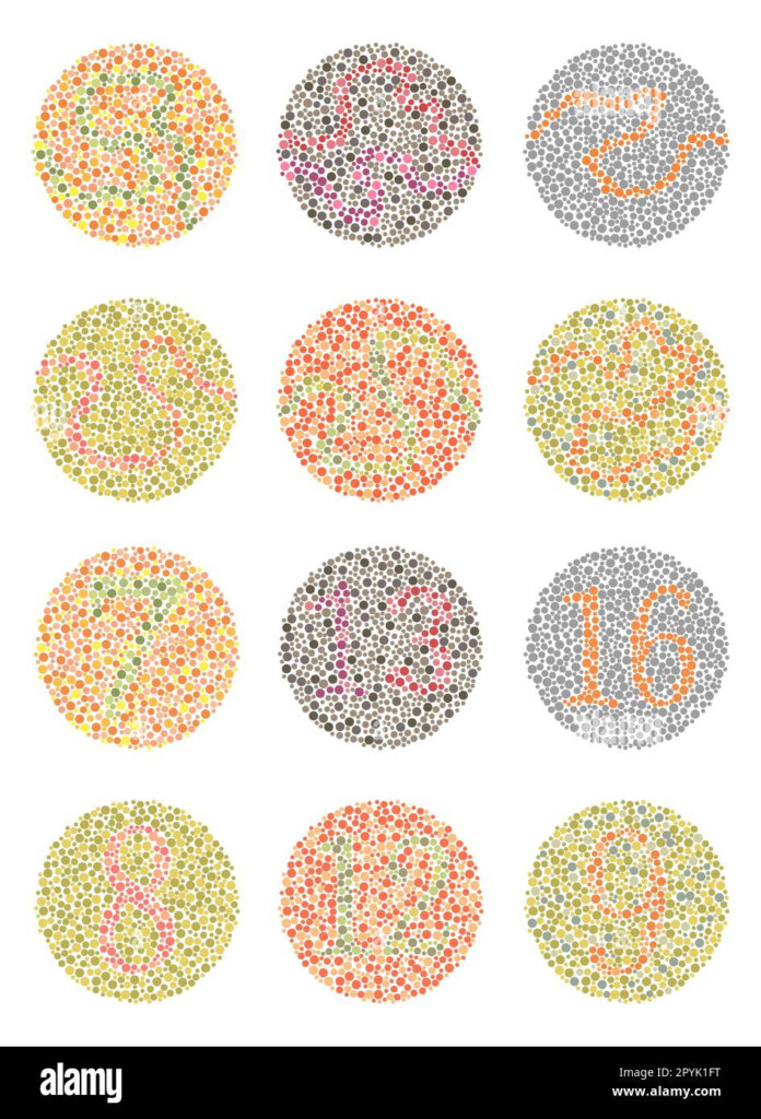
Color blindness is a common condition that affects a significant portion of the population. It can impact a person’s ability to distinguish between certain colors, which can have serious implications in various aspects of their lives, from everyday tasks to career choices. This is why it is crucial to use a chart for color blindness to ensure that information is presented in a way that is accessible to everyone.
By utilizing a chart specifically designed for color blindness, you can ensure that important data and information are easily understood by individuals with this condition. These charts use colors that are distinguishable to those with color blindness, making it easier for them to interpret the information accurately. This can be particularly important in fields such as graphic design, web development, and healthcare, where color plays a significant role in conveying information.
Chart For Color Blindness
Types of Charts for Color Blindness
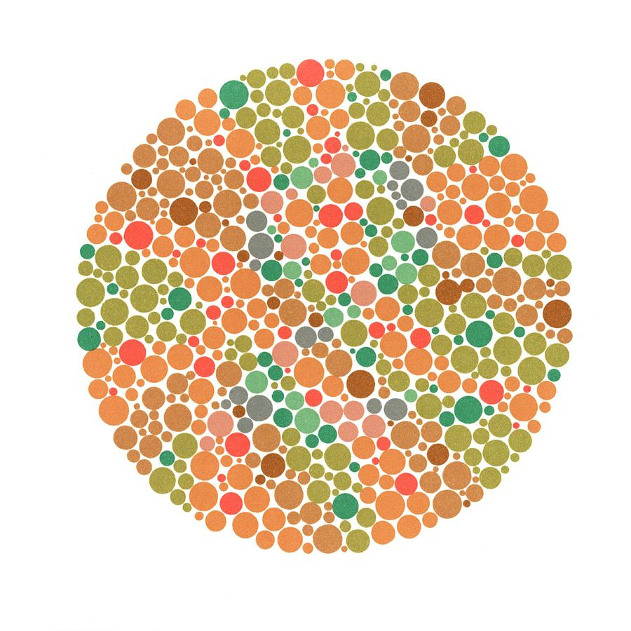
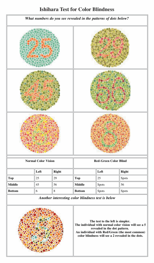
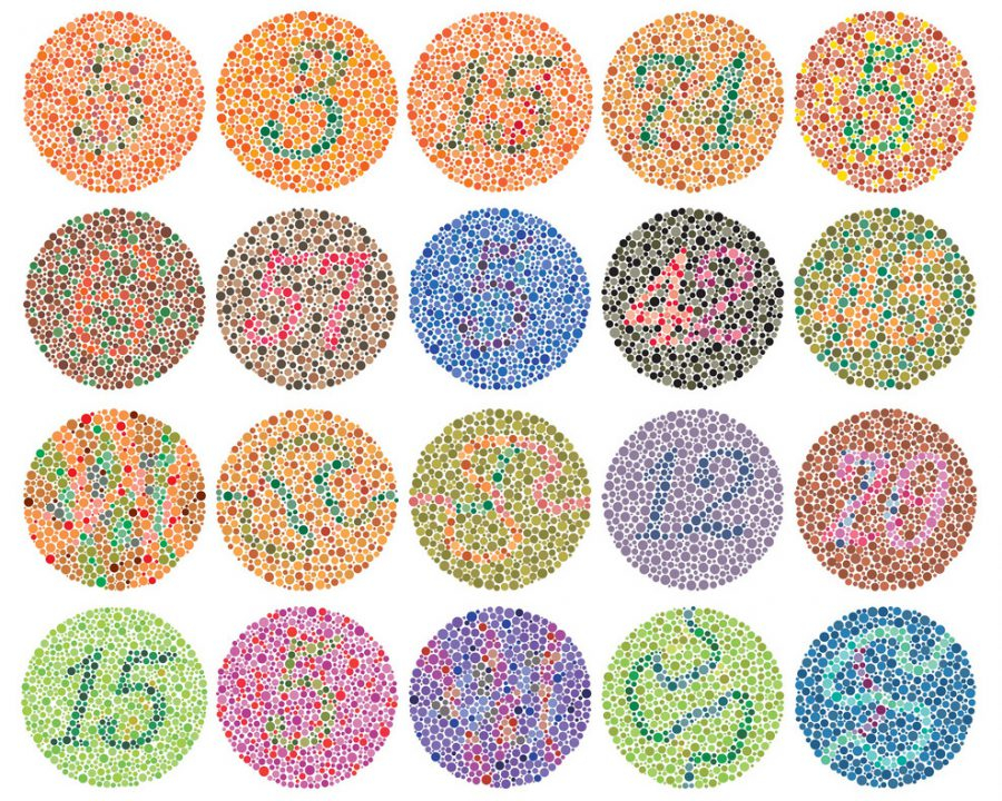
There are several types of charts available for color blindness, each designed to cater to different types of color vision deficiencies. One common type is the Ishihara color test, which uses a series of colored dots to determine if a person has color blindness and the type of deficiency they may have. Another type is the ColorADD system, which uses symbols to represent different colors, making it easier for color-blind individuals to understand color-coded information.
Additionally, there are online tools and software available that can help create color-blind-friendly charts for various purposes. These tools allow users to input data and customize the colors to ensure that the chart is accessible to individuals with color vision deficiencies. By incorporating these tools into your design process, you can ensure that your charts are inclusive and accessible to a wider audience.
Tips for Creating an Effective Chart for Color Blindness
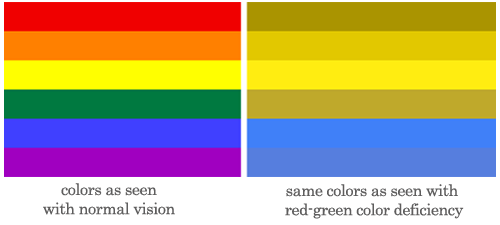
When creating a chart for color blindness, there are several tips to keep in mind to ensure its effectiveness. Firstly, avoid using red and green together, as these colors are the most problematic for individuals with color blindness. Instead, opt for colors that have a high level of contrast and are easily distinguishable, such as blue and yellow.
It is also important to provide alternative ways of conveying information, such as using patterns, textures, or labels in addition to colors. This can help individuals with color blindness interpret the information accurately, even if they cannot rely on color alone. Lastly, test your chart with individuals who have color vision deficiencies to ensure that it is accessible and easy to understand for everyone.
By following these tips and utilizing charts specifically designed for color blindness, you can ensure that your information is accessible to a wider audience and avoid potential misinterpretations due to color vision deficiencies.
Download Chart For Color Blindness
Color Blindness
Color Chart For Color Blindness Color Vision Test Chart
Color Chart For Color Blindness Color Vision Test Chart
Ishihara Test For Color Blindness Chart Download Printable 40 OFF
